Branding for The Sinclair
- Mar 31, 2021
- 1 min read
Updated: Aug 24, 2021
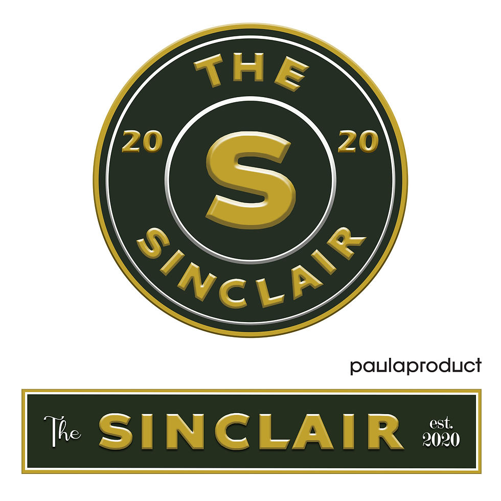
An encouraging client of mine gave me the rare opportunity to design the building sign and restaurant logo for The Sinclair. The Sinclair will inhabit an old Sinclair gas station that was built in the 1920’s. With a nod to the original, we wanted to use similar colors and vibe while modernizing it and softening the appearance of the sign and logo. Harmonizing the design of a space includes connecting exterior and interior characteristics, relating details large and small and a balance of the combination of bold and subtle. I love the opportunity of aiding overall and not only one piece of the design experience. paulaproduct can be there for every step of your project's design journey.
See the design study and evolution of the rectangle sign and logo mark.
-Paula


Comments